This is a post where i will out line some of the tools i have used whilst creating my mag ads. I mainly used the programme Adobe Photoshop Elements but i also had to download some fonts as well as taking relevant pictures to go on the mag ad.
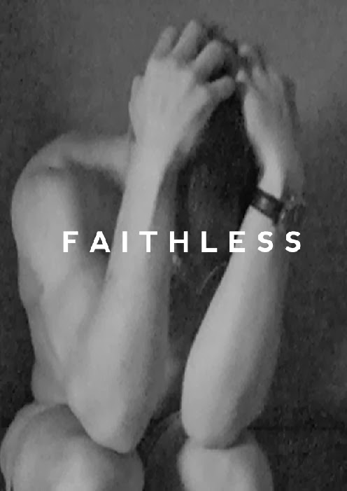
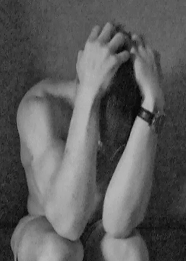
This was initially the start with no main ad conventions as i was trying to correct the background image. I think the image on its own is very powerful however its a very distorted image which i need to filter.


This above is the plastic wrap tool which i used. which really does as it says - gives it a plastic cover. With this filter it ads brightness to the image which makes it stand out more which is a benefit, however it is very different from Faithless' past magazine ads.


 Another idea i came up with for the magazine ad was a full page reflected image. This is something similar to what i have found in my research of faithless' magazine ads. As the image on the right shows maxi in reflection with another performer. As jake is the only performer in our production i would reflect two images of him back to back which would merge in the middle, instead of being apart like the faithless example.


This was initially the start with no main ad conventions as i was trying to correct the background image. I think the image on its own is very powerful however its a very distorted image which i need to filter.
The crosshatch filter enhances the image slightly, although it gives it a more artistic effect as if its almost been sketched. i do like this filter because its simplistic.
Accented edges filter is similar top the cross hatch filter which is why i chose to change the width, brightness and smoothness. The smoothness tool works really well in effect as it un distorts the image. However, the balance has to be just right between these three bars as it can drastically change the image if one is extremely high whilst one is very low.
The image above is the accented edges filter but with the brightness all the way down. As you can see it changes the picture to a much darker, deeper image.
This is the smudge stick tool brings out the image from the background.
Another idea i came up with for the magazine ad was a full page reflected image. This is something similar to what i have found in my research of faithless' magazine ads. As the image on the right shows maxi in reflection with another performer. As jake is the only performer in our production i would reflect two images of him back to back which would merge in the middle, instead of being apart like the faithless example.
Above is the initial design idea, for this design i was looking to use different fonts and also add filters to the pictures as well as including the common conventions.
The filter i tried above is the torn edges filter, which completely changes the visuals in the image and changes it to block black and white.
The other filter which i particularly liked was the conte crayon which distorted the image slightly but the image is still visible.
This is the mag ad draft which includes my researched mag ad conventions.
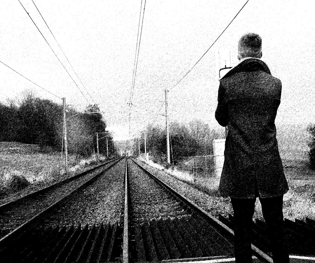
This is the next image i was going to use for a magazine ad. I am going to try incorporate layering in this ad. The image allows space for layering on the left hand side.
This is the graphic pen edit which looks good.
No comments:
Post a Comment